Thursday, October 3, 2013

VISUAL FORCE INTEGRATEDLINE AND BAR CHART:  Visual force pages can be used for Charting also. The following VF page uses a custom controller “LineAndBarController” and is used to create an integrated line and  bar chart for Revenue per Month and Opportunities Closed per month.

Here the Line shows the Opportunities Closed and the Bar shows the Revenue per month  in the year 2011.

VisualForce Page:

<apex:page controller="LineAndBarController" showHeader="false" readOnly="true">
    <apex:chart width="600" height="275" data="{!data}">
        <apex:axis type="Numeric" position="left" fields="numOppsClosedWon"
            title="Opportunities Closed" grid="true"/>
        <apex:axis type="Numeric" position="right" fields="monthlyRevenue"
            title="Revenue (US$)"/>
        <apex:axis type="Category" position="bottom" fields="theMonth"
            title="2011">
        </apex:axis>
        <apex:barSeries title="Monthly Sales" orientation="vertical"
            axis="right" xField="theMonth" yField="monthlyRevenue"/>
        <apex:lineSeries title="Closed-Won"
            axis="left" xField="theMonth" yField="numOppsClosedWon"
            markerType="circle" markerSize="4" markerFill="#00FF00"/>
    </apex:chart>
</apex:page>

Controller Class:
public with sharing class LineAndBarController {
                    public List<AggregateResult> getData() {
        return
            [SELECT SUM(Amount) monthlyRevenue, COUNT(Name) numOppsClosedWon,
                  CALENDAR_MONTH(CloseDate) theMonth
             FROM Opportunity
             WHERE stageName = 'Closed Won' AND CALENDAR_YEAR(CloseDate) = 2011
             GROUP BY CALENDAR_MONTH(CloseDate)
             ORDER BY CALENDAR_MONTH(CloseDate)];
    }

}


Tuesday, October 1, 2013

VISUAL FORCE CHART:  Visual force pages can be used for Charting also. The following VF page uses a custom controller “ChartController” and is used to create a bar chart for Revenue per Month.


Monday, September 30, 2013

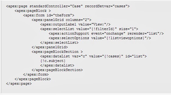
VISUALFORCE DASHBOARD COMPONENTS:  Visual force pages can be used as dashboard component also. The following VF page uses a standard controller “Cases” and is invoked in dashboard to give a list of all the cases.


Tabular Report with Row Limit

TABULAR REPORT WITH ROW LIMIT:  The following is a Tabular report that shows Row Limit. When you run the report only the limit of rows specified are shown which can be sorted ascending or descending by any field.
In the example below the fields are filtered and the row limit set to 10.


Friday, September 27, 2013

Support Calls by Priority Report in Salesforce

SUPPORT CALLS BY PRIORITY REPORT: The following report compares the number of support cases that are new, closed, or in-progress by priority. It contains a single standard report type: Cases. 
The field used for grouping is “Priority” and for each block the “Status” field is set to closed, new, or working, escalated.

Thursday, September 26, 2013

Events with Lead Report in Salesforce

EVENTS WITH LEAD REPORT: The following is a matrix report showing the events with leads. The report is grouped by Leads and the Subject.
The report group all the leads that were "email, phone call, meeting" and another group "email, phone call,  meeting" and another "phone, meeting, email",... and so on.

Tuesday, September 24, 2013

Salesforce Opportunity Pipeline Predictor

OPPORTUNITY PIPELINE PREDICTORUsing cross-block custom summary formulas, we can create a report that predicts Revenue based on a sales representative’s performance. The report below is an Opportunity Pipeline Report in Joined Format.
The cross-block custom summary formula to calculate Revenue is:
[Closing Next Month]AMOUNT:SUM*([Closed - Won]RowCount/([Closed-Lost]RowCount+[Closed-Won]RowCount))